


 How come only mid range wines get cool labels? The pricey cat piss almost invariably has THE dullest, most dreary and humorless, uptight and absolutely forgettable wrappers. What’s the deal? They’re charging an arm and three legs for the damn grape juice couldn’t they spend a shekel or three to dress up the outfit?
The cheapest plonk is only occasionally and marginally better—there’s a little added color and, sometimes, a bit of humor. Specifically, I’m talkin’ about the Cheap White and Cheap Red Wine (that's the brand name). The label’s not a rhapsody of color, it’ll only get framed by Andy Warhol lovers BUT it’s amusing and expressive. I like it. Dunno what it actually tastes like but I’m inclined to pick up a bottle of Cheap Red Wine and find out.
 I’m not a fan of the Old Fart Wines—the label, while funny and colorful just doesn’t make me want to buy. Why not? Eh, the codger illustration’s a little too evocative for me. I can smell the three day worn socks, the stale Marlboro aroma and the cat box that’s not been sifted in a week. Doesn’t put me in a wine quaffing mode. A friend picked up a bottle so I’ve had a sip. Eh.
Now, these wines, these labels totally appeal. They draw me in and def inspire me to try all their grapey variations.
Bully HillI’ve had all of these. In fact, these are my usual picks when I find myself in the Adult Bev Emporium. Why? They’re delish AND the labels are beautiful or funny or BOTH!
Smoking Loon
Big House
Fat Cat
Other wines I’d like to try based solely on their label art?
Blue GrooveHow much are they? Can I afford them? Dunno but I’m gonna find out. The art calls to me.
The Seeker
Therapy (heh, a wine called Therapy. PERFECT!)
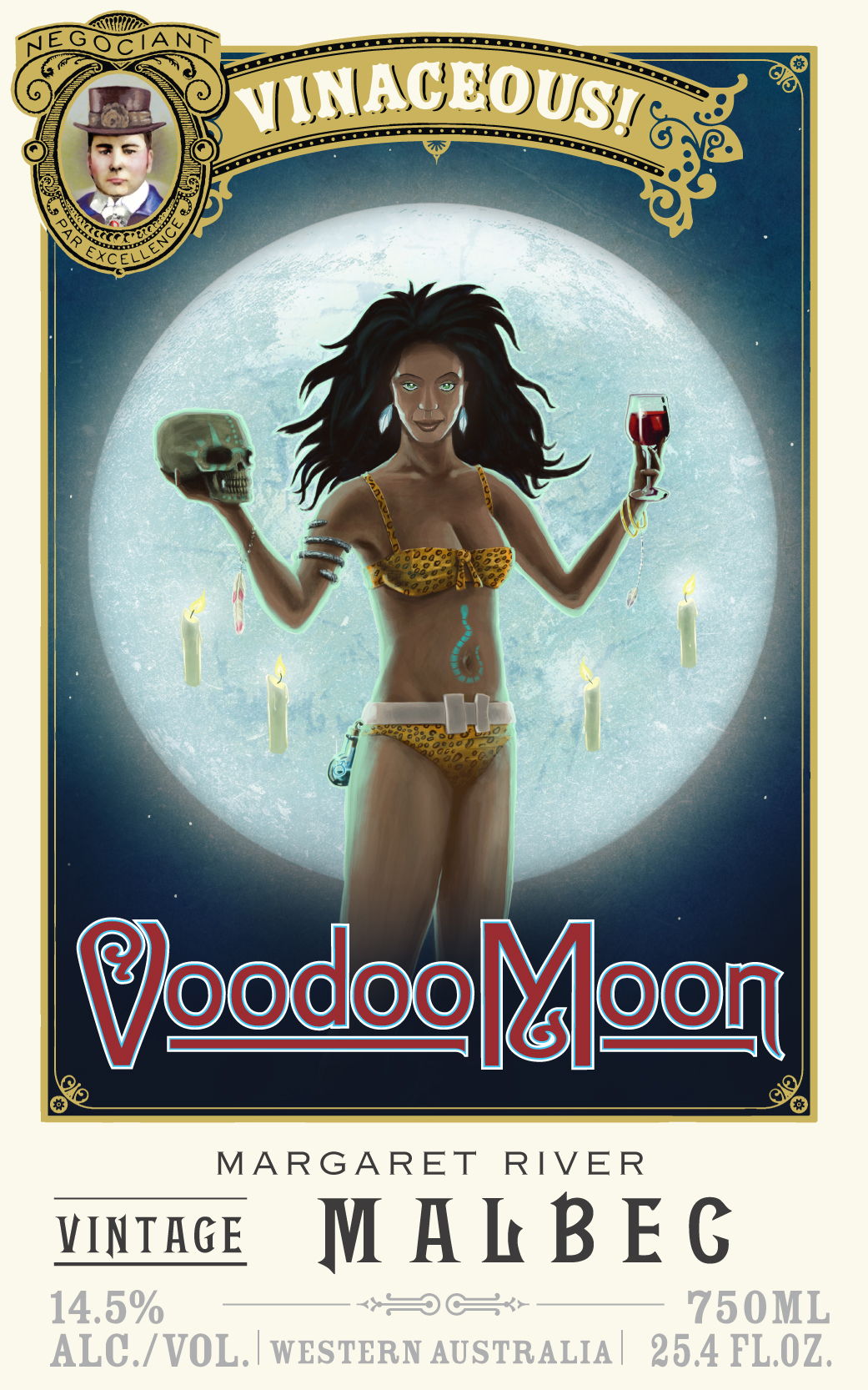
and Voodoo Moon and Raconteur from Vinaceous.
Also too, YES, I do judge books by their covers but then, you knew that already.
No comments:
Post a Comment