
 As I motor about town, running errands, I find myself noticing a lot of pretty heinous advertising, promo and ancillary signage.
There’s DG’s Lawn Service. Why is serious about service in quotes? Did someone say that about them? If so, how about crediting them? Does DG mean it as snark. As in “yeah right, we’re “serious about service” alright”— I doubt that’s the case but, ya know, the scare quotes make me curious.
Sweeney Brothers with it’s tag line “Home for Funerals.” What? Is this like Home Depot only for dead folk and their families?
 I get it, everyone wants a catchy tag-line, something to really grab the marks' attention. Still, even if your marketing budget's tiny so you've given your sister’s kid, (who’s taking Biz 101 at the juco), a shot, you really should show that line around. Be daring, ask the opinion of folks who aren’t inclined to praise you (or your sister's kid) at ever turn.
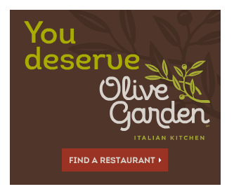
I wonder what Olive Garden’s excuse is? Surely they have mondo advertising bucks. This ad popped up on my screen the other day. This being just one of their new tag-lines, used in a desperate attempt to recapture customers.
So, I “deserve” Olive Garden with their high calorie/sodium packed/saturated fat meals? I deserve to eat at a chain restaurant whose profits don’t go into the local economy but, instead, into some corporate center with mega bucked CEOs?
What should they say though? “You deserve good, healthy food served in smart portions but, well, we’re all about excess, salt and fat so, hey, come on in. Be sure to order that deep fried app and dessert too.” Somehow, I doubt that’d be the most effective marketing strategy. Plus, too many words for a snappy tag-line.
Being in the print industry, doing design/layout, I get kind of snitty about fonts. I see poor choices and other craziness everywhere…..or so it seems on some days
 In the parking lot of our local Lowe’s, I came across this shopping cart return stall. “Return” is in Rage Italic. Really. Rage Italic for a shopping cart sign at Lowe’s. Sure, it’s one of the more easily read of the decorative script fonts BUT on a sign whose purpose is mundane yet important, it makes best sense (for the end user—the customer) to employ an instantly readable typeface. Arial Black, Impact or ArtBrush mebbe?
This smacks, to me, of a young bored designer at their corporate office who wanted to make a splash. Fine. Lovely. Go find a gig where your creative expression makes more sense.
 I only mention it but I totes love A Trip To Hell And Back (the font, not the adventure!) but I’m not gonna use it for anything other than the title of an appropriate doc (say, one on the gritty awesomeness of Imperator Furiosa) Maybe not even then. OK, a confession. I used it for the sign on our mailbox. It’s the typeface in which The Amazing Bob and my names appear. The mailman knows we live here. It’s OK that it’s not immediately clear.
A minor, personal, font kvetch—see these two salons? RIGHT next door to each other? The type choice for their names says everything I need to know. Maybe. The one on the right uses some fat, juvenile, trite script font whereas the one on the left uses Helvetica Neue—understated, sleek, mature. OK, it’s one of my faves.
Maybe the folks at 1604 Salon&Spa are brittle over serious fashionistas. Perhaps the folks at Fancy Salon are ham-handedly artless bourgeoisie. I won’t know unless I pass their respective thresholds.
Wanna be a font geek too? This page from the good folks at Perdue will help. Gosh, I’m so helpful, eh?
No comments:
Post a Comment